It's interesting to compare the user responses to updates by Facebook and Twitter respectively.
Facebook's UI has changed significantly over the last 15 or so years. Features have appeared and disappeared, boxes have been arranged and rearranged. But there's rarely a big fuss beyond it getting a little slower each time (roughly commensurate with consumer hardware speedup, in fact). People don't really notice and they don't really care. People originally balked at the reactions feature, calling it gauche and unnecessary - but now people use it as part of the language of the platform without a second thought.
Compare with Twitter. Every UI "overhaul" they've ever done has been received in a hugely negative way. The only change which has been remotely successful was the 140/280 switch.
The difference is threefold:
First, Twitter's UI changes have been big. They skip over incremental changes and go straight for gigantic overhauls. This requires people re-learn the language of the site completely every couple of years.
Second, these changes have invariably been coupled with user-hostile design decisions. The obvious one this time round is the automatic switching to "AI sorted timeline" on every visit. No wonder people have an almost pavlovian response to the design changes.
And thirdly, while Facebook's changes are usually to accommodate changing usage patterns, new features, or new hardware, Twitter's updates are very transparently pointless. They offer zero improvement to the user experience for any sector of the market. Every change causes people to question why they use the site in the first place.
Gosh I didn't expect this to be such a long rant. Turns out I have a lot to say about the terrible design decisions made over in Twitter land. The conclusion is this: people don't hate change. They hate change which makes their lives worse than the status quo would have done. It's not complicated.
> Facebook's UI has changed significantly over the last 15 or so years. Features have appeared and disappeared, boxes have been arranged and rearranged. But there's rarely a big fuss beyond it getting a little slower each time (roughly commensurate with consumer hardware speedup, in fact). People don't really notice and they don't really care.
Are you using the same Facebook as I do? Every time they rearranged more than a single button there was an uproar. People do care, but there's exactly nothing they can do except whining. Facebook doesn't care, and people won't leave because their friends are there.
I guess that's a side effect of the siloing that goes on on Facebook. I certainly heard nothing major about it, and orders of magnitude less than the same/similar people about the Twitter redesigns.
In the earlier days of Facebook, say until 2012 or so, there were definitely huge uproars when there were major changes. I think that after a while people just had basic "learned helplessness" symptoms - there weren't really any possible alternatives to FB due to network effects, so they just got used to it.
People do hate change, regardless of how much better that change is. I don't think I've ever seen a UI redesign over which users didn't get into a massive uproar. I certainly saw the massive uproar any time FB introduced a UI change.
Sure, some UI redesigns are just plain bad and users are justified in hating them. The twitter redesign does appear to be clunky/bad as you noted. The new Reddit seems to be another case of the redesign being pretty bad.
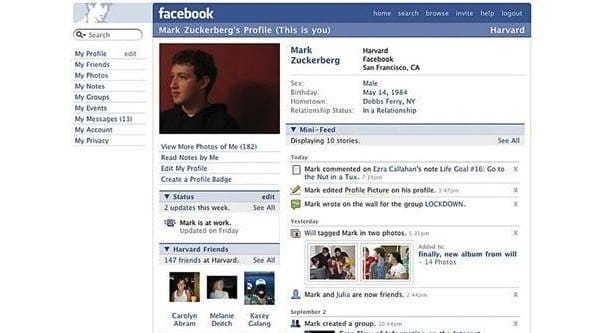
But users will unfailingly hate every major redesign without fail regardless of how much better it is. If users had their way, Windows 10 would still look like Windows 98. Facebook would still look like this [0].
I liked Windows 7 so much more than Windows Vista I probably can't express it. Same when Firefox moved to a slimmer UI. Anecdata, of course, but "users will unfailingly hate ever major redesign without fail regardless of how much better it is" seems impossible to substantiate.
> I liked the iOS redesign immediately. Now we're all so used to it, and now looking back iOS 6 looks like a janky toy, but most people hated iOS 7+.
These two sentiments are not necessarily incompatible. iOS 7 absolutely made iOS 6 look old and clunky, and I could never go back. But I also still actively hate the pure-white world of iOS 7 seven years later, and don't get me started on the Safari icon. It'll be curious to see how things evolve in the post-Ive world.
I wonder if the opposite effect also exists: a solid redesign that also lifts up the previous version in hindsight.
I think there's a difference (moreover, a percievable difference) between a UI redesign which users hate and a UI redesign which users merely complain about. People love complaining and will happily point out the rough edges of anything put in their eyeline, but that's not the same thing as disliking it in a vacuum.
No, this is not true at all. In fact, the very first software project I was paid for was a perfect example: I had to replace an ancient DOS based database app with something more modern. The end result had a GUI that was completely different, barely retained the same workflow, had tons of new input validation that users had to cope with all of a sudden. End result? They had a knee jerk hate for it when they saw it. They would have to re-learn routines they had settled into for about 10 years. So there was push-back.
And it didn't last: a few weeks after the transition everybody told me that they liked the new app so much more. Why? Because they couldn't make that many dumb mistakes anymore that were tedius to correct. The app kept track of more information behind the scenes that helped then woth processing the data and - that was the main reason IMO - I had carefully designed a ton of tiny nearly invisible helpers into the UI that helped a lot with data entry. There was stuff like autocompletion that had context sensitive suggestions, form fields would pre-fill with the most likely values where appropriate etc. It was fairly subtle. It took a while for the users to learn all that. But once they understood the new way of doing things, noone wanted to go back anymore.
I did show and explain repeatedly and patiently. It was just so different and bewildering on the surface that users were instinctively hostile to it at first.
With that rationale you literally can't change anything ever. Version 1.0 ever after.
It is better if it ultimately just takes time for them to like it. The same people who initially hated it will most likely grow to like it. When we migrated from Windows 7 to Windows 10 last year, my boss was extremely upset--but he was just as upset a decade ago having to upgrade to Windows 7 in the first place.
God I hate this kind of paternalistic reasoning from developers. Nobody is saying that you can never update software ever, just that those updates should be driven by a clear functional reason. Implementing a change that you know your users will hate just to switch to a "modern" UI does not serve users.
> Users come around eventually.
How do you know? A number of apps I use have overhauled their UI in a way that made it look shinier at a glance, but categorically worse for actually using. I either stopped using them if the change was too awful, or eventually just stopped leaving negative feedback once it was clear the devs didn't care. Never once have I hated an update at first and later thought to myself, "Wow I was so wrong, this update is actually amazing, I'm glad the dev team ignored all of that negative feedback and forced it on their existing users".
> With that rationale you literally can't change anything ever. Version 1.0 ever after.
The point was IF users hate it, you probably did something wrong in the redesign. That doesn't exclude the possibility of doing a redesign that users are excited about.
Plenty of IM clients I use update semi-regularly with new features, and I'm either neutral or excited based on whether I plan to use that feature, but I'm never upset because they're not breaking my existing workflow.
And, yes, sometimes a redesign just takes time to come around to, but there's also lots of redesigns that genuinely reduce functionality. I've lost track of how many times an update has outright removed a favorite feature of mine, reduced configuration options, and so on. This might be a sensible business decision, but it's not to my benefit.
> Every change causes people to question why they use the site in the first place.
I was using twitter to follow very few, high quality feeds, and with this new update it was made clear that the intended usage is the opposite. No more twitter for me, I'm back to good old RSS feeds.
Beside that, I can't believe anyone would find the new design better than the old one on a monitor, the menu has more presence than the actual tweets.
The Twitter redesign (last week or so?) has been wonderful for me: it keeps your place in navigation, allowing you to look at a tweet thread and go back to the place you were before.
Previously on Twitter, after any navigation you'd lose your place, having to scroll (and reload all the previously-seen content) very far if you were down far.
On the other hand, every time I have been back since the changeover, they reset my feed to 'algorithmically chosen tweets' (or whatever they call it) instead of the "by time posted" option I invariably want and choose. It's gotten so I'm pretty unlikely to go back to Twitter now, since along with this major annoyance, it's ugly, cluttered to the point of near unusable, and all-round annoying to me. So long and thanks for all the tweety birds, I guess.
Because they want to control what people see in their feeds to prolong eyeball seconds, which you get by hiding what you find interesting in piles of poo.
That's a great observation. I've had similar thoughts about Windows 8/10 changes and the reaction of their long term users. Incremental does seem to be the best way. People also tolerate dramatic changes well if there's an option to revert to the old ways.
Which is something Microsoft used to do well. Almost every big user-facing change, like the Aero desktop, could be reverted back to "Classic" if the user wanted. Or a feature considered obnoxious could be disabled. Either via the Control Panel, or via a group policy. It's difficult to hate a new feature or UI change if you can simply turn it off. But, with 8 and 10, they switched to a much more restrictive attitude and their reputation took a considerable hit.
This is something Apple is doing well with iOS. Obviously, 6->7 was a disruptive (and controversial) transition. But since then, their incremental approach seems to have worked very well.
"First, Twitter's UI changes have been big. They skip over incremental changes and go straight for gigantic overhauls. This requires people re-learn the language of the site completely every couple of years."
Honestly, I think that this is part of the point, at least with social media applications. When people get used to an application, and it works predictably, they have control over their use of it, and can fit it into their lives how they see fit.
This isn't what social media companies want. Social media companies want users to spend as much time using their applications as possible which means setting up skinnerbox-esque mechanisms as much as possible which requires the application to at least be a little bit unpredictable. Replacing time based news feeds with unpredictable algorithmic ones is one way to do this, but any kind of change throws the user's sense of balance off. If the user doesn't quit right away (and most don't) they have the potential to become more dependent going forward.
> Features have appeared and disappeared, boxes have been arranged and rearranged. But there's rarely a big fuss
I mean, I pretty much hated everything Facebook did since I used to have an actual news feed of things my friends did/said. Peoples profiles stopped being a place to go and put things. Conversations moved from wall to wall, to comments with the stupidest fucking nesting and ui I've ever seen.
I never really used twitter - so can't comment - but facebook drove me off their platform as much as I outgrew it.
As for noise/fuss - Twitter is a shouting platform where things snowball in a different way.
Wow, that Twitter thread was horrible. Users: “this UI change is terrible, please provide a way to opt out!” Designer: “You’re all wrong. I’m an artist and I say it’s better. Get over it!”
Literally the trashiest response a developer can have to honest end user feedback. All ego. May I never have to work with this guy.
Facebook's UI has changed significantly over the last 15 or so years. Features have appeared and disappeared, boxes have been arranged and rearranged. But there's rarely a big fuss beyond it getting a little slower each time (roughly commensurate with consumer hardware speedup, in fact). People don't really notice and they don't really care. People originally balked at the reactions feature, calling it gauche and unnecessary - but now people use it as part of the language of the platform without a second thought.
Compare with Twitter. Every UI "overhaul" they've ever done has been received in a hugely negative way. The only change which has been remotely successful was the 140/280 switch.
The difference is threefold:
First, Twitter's UI changes have been big. They skip over incremental changes and go straight for gigantic overhauls. This requires people re-learn the language of the site completely every couple of years.
Second, these changes have invariably been coupled with user-hostile design decisions. The obvious one this time round is the automatic switching to "AI sorted timeline" on every visit. No wonder people have an almost pavlovian response to the design changes.
And thirdly, while Facebook's changes are usually to accommodate changing usage patterns, new features, or new hardware, Twitter's updates are very transparently pointless. They offer zero improvement to the user experience for any sector of the market. Every change causes people to question why they use the site in the first place.
Gosh I didn't expect this to be such a long rant. Turns out I have a lot to say about the terrible design decisions made over in Twitter land. The conclusion is this: people don't hate change. They hate change which makes their lives worse than the status quo would have done. It's not complicated.