I don't know if you actually liked this or not, but I did. It displayed a deep knowledge of how to manipulate design elements to implant an idea in a user's head.
There's nothing dishonest about it, it's just a design element.
Actually, I found it dishonest. It's the equivalent of small print to me. I'll do a walk through of my initial reaction when I saw those logos.
1) Oh! Those companies have purchased this before to make their sites better! If they stand behind the product then maybe I should look into buying it.
2) Hmm...they didn't purchase it. Maybe the creator of this product was part of the design team for those websites and he knows what he is talking about.
That's an extremely narrow view of "dishonest" if "dishonest" means "made me make an assumption that it itself clears up in English plain text in plain view".
You're supposed to be a UX designer. And you honestly can't see how that looks like social proof, that you are visually implying that these companies use your product?
I want this book so bad. But your contact form is awful. You can't design the simplest form on the web. You don't actually seem to have any actual experience in designing web apps, working for one unidentified startup.
I'm afraid I'd be spunking my money.
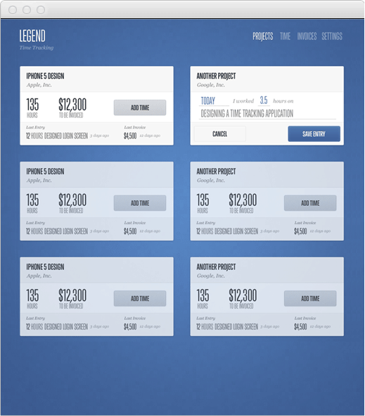
The screen shots are awful and show you can't actually design a good UX, take this as an example:
Are you drunk? What a vile, illogical, and empty rant.
OP didn't say he doesn't think it looks like social proof. He stated that it wasn't intended to function as social proof, and gave his motives for placing the logos. Seriously, I mean seriously, you couldn't have read that properly? You're supposed to be a HN poster, and you honestly can't read a post properly?
Instead of repeatedly insulting the guy, yelling about how he can't do stuff, and providing examples of his incompetence, why don't you show/tell how things could be improved?
Don't know why people are saying you're an ass for calling out glaring design flaws in a $200 book about design. I felt similarly about Sacha's book on UI, but it was only $6-$12 so it didn't seem worth complaining about. If people want to drop two coffees on something they think they'll get value from, that isn't a big deal. Additionally, the app he designed for actually exists.
This is a little different from Nathan's offering because as far as I can tell, there is no end product, nor are the examples provided good indicators of good visual design or UX.