My questions as someone learning web development and always searching for new (quality) resources: Who are you? And why should I pay you $200?
> Previously I led the software design team at a local startup, but in the last year I have been working independently designing and developing my own apps.
After seeing the $200 price tag, I expected to read something along the lines of "My web apps have been used by over X million users", along with a few examples. Or maybe "I built the websites for these well known companies". Since that isn't the case, the next thing I looked for to establish your credibility was reviews. Hmm, also missing.
For the price of the book alone ($29), I could watch 100+ hours of tutorials on a site like Lynda or Tuts+ from a variety of developers with similar experience. I'm having a hard time verifying that the value of the resources matches the price tag.
Sorry if this seems overly critical, figured you might want the honest opinion of a hesitant customer who could potentially be converted. I may still buy one of the packages after I read through your blog some more.
The worst thing is to have people not buy, but have no idea what kept them from making the purchase. So thank you for the feedback!
I'm not someone super famous, but I have designed a lot of software applications used by companies ranging from Johnson & Johnson to Hobby Lobby. But they were clients of the company I used to work for (have since left), since I now work on my own I can't call them my clients.
> "The worst thing is to have people not buy, but have no idea what kept them from making the purchase"
That is very true.
My feedback: I visited your page and did not buy because I have zero revenue on my sites, and I have bought already so many things before (books, hosting, web templates, logo, etc) that I am in a "puzzled mood". I also did not feel the offer was for me. Right now my problem is figuring out how to make money out of my sites' visitors. To clarify I am one step behind where you are: I look at many options and wonder which way to go. Building a web app is one option, but it takes lots of time, and I would like to first get some confirmation that it is the right option to go for. Other option I consider is creating content (tutorials, forum).
He's not going to be able to change who he is, so if he's not well known then he's not well known.
If you think being famous is what makes someone qualified to create a product you want to buy, then you're not going to buy his product. That's just the beginning and end of that question, and he shouldn't worry about that one bit.
He's not going to sell as many books as DHH would, but hopefully the product stands on its merits and will provide more value to its readers/watchers/interacters than what they paid for it. My guess is that to many it will.
> If you think being famous is what makes someone qualified to create a product you want to buy, then you're not going to buy his product.
That's not what he said. He only asked for some evidence that the writer is really good at "Designing Web Applications", and knows what he's talking about.
I agree, $200 is way too much to pay for content from a person I've never heard of, and couldn't find any easy reference in the page. With that kind of money you can get a lot of good content in a lot of places.
I just don't see the differential that would make me spend that much money on this.
No known clients, no big companies in the past. It makes me hesitant to even consider buying this.
Disclaimer: I was interviewed for the book and just finished skimming through my copy.
First off, Nathan generously offers a full money back guarantee. If you don't find the book's value outweighs the cost, ask for a refund.
Second, yes, you can wade through hundreds of blog posts or whatever else to find a lot of what Nathan presents in the book. But I value my time, and the overhead of doing that filtration vs. having Nathan do it for me is worth a lot more than $200, especially if I build web apps for a living (which I do). There is relatively little new information under the sun — but I gladly pay people to package the best available information up and tie it all together nicely.
> For the price of the book alone ($29), I could watch 100+ hours of tutorials on a site like Lynda or Tuts+ from a variety of developers with similar experience. I'm having a hard time verifying that the value of the resources matches the price tag.
Dude. Do you realize that you are valuing your time at approximately 25 cents per hour? I suspect you have other, deeper reasons for not investing such a small amount of money in something that, by the way, comes with a full guarantee.
I edited your site to solve the issues and uploaded to imgur. (The matrix is from CrazyEgg, but take the idea). http://imgur.com/slYOb
Here is my walkthrough of the site:
1. Great, exactly what I am looking for: book on designing web applications.
2. Oooh look, Facebook, Freshbooks, and MailChimp use this, wait, no they do not. This is graphically implied by their logos and using an established user experience location, not happy about being tricked.
3. Jump to packages: $200! Good day, sir.
4. Wait, it cannot be that expensive, scroll down some more and find the book. Now I am worried about what I am purchasing as the person trying to sell this does not understand basic concepts of web design, tricked me, and wants a ton of money.
5. Head back to Hacker News to determine if anyone knows who Nathan Barry is and if he is a reputable person.
Place your layout of prices in a pricing, side by side. The scrolling down through the site is not helpful in making me feel better about purchasing a design book when one does not employ basic pricing structure layouts see this site for examples (http://bit.ly/lVPfr4). You could skip to a pricing matrix, then scroll down further to see more of it.
Recognizing that you are trying to present the highest price first to drive higher revenue, you need to reverse the order in the case of a scroll driven price change. Get the user to the first option, the book, then the user will see that there is more content on the page (scroll bar, images / graphics below book option). This teaches the user that there is more below each price mark and you would drive futher sales when a user sees the added benefit for each item.
Another item would be to have a try the book and buy more option later. This could be done in a constant contact format.
Piggybacking on this comment (because I agree with everything he said):
- After scrolling all the way to the bottom, I realized I had no idea how to buy the book. Scroll back up, back down. Where are the buying buttons? Oh, they are hidden as cutesy circles that display the price, that I only noticed when mousing over. Not easy to find. Slap a big "BUY NOW" button under the price.
- Not enough visual separation between packages. Content listings flow into the next package without a clean, obvious break. While quickly skimming it is easy to lose track of what attaches to what.
- Your "Buy a team license" is like a baby footnote and I didn't see it until I had skimmed up/down three times (aka more than someone will do before exiting).
-No big buy button at the bottom. Don't make me scroll back up to the package listing and hunt for the button. Give me an easy way to purchase when I hit the bottom
- IMO, too much text above the fold. I read the headline, one sub-headline then started skimming. The giant "Generic eBook" image doesn't do much for you either.
Not criticizing your book, I'm sure it has wonderful content. And landing page design is a unique beast, which is different from designing general UIs. I meant this criticism only to help :)
Goodluck with your book! I may try the eBook to see how it is.
I had the same reaction to the Facebook, Freshbooks, and MailChimp logo placement. Struck me as a little shady. The book sample is excellent though, and I'm considering the $199 package, primarily for the web app .psd.
Reading your comment, I asked myself "There was a sample?"
Another design issue of note, I had skimmed past that portion during the scroll down because it was not highlighted. There should be some sort of color change.
I'd mentioned something similar to #4 in a previous post about this project. With all due respect to Nathan's efforts and marketing throughout this process, I thought he was a developer trying to teach design rather than a designer, considering the layout of the page and the preview screenshot (doesn't look like an actual app, poor typography). And this might just be me, but I'm wary about a WordPress template for a simple one page site when we're talking about web development.
Taking screenshots of your [subjectively] favorite experiences and writing about why you think it's good UX (when there are more qualified resources for this), coupled with teaching people how to do some basic Photoshop [instead of actual code?] when we have endless resources for such isn't worth $200 for me, the assumed target market. Do you go over why you you the beveled aesthetic works, or do you just think it's cool? Because that's how I'm reading most of this PDF preview; that's just like, your opinion man.
As such, there should be tiers based on what I want out of this; the design, the UX or the interviews. Even then, ~$65 for interviews from people that write about their experiences on their own - for free - doesn't sell me. Sorry :/
The "complete package" gave me sticker shock, so much that I almost closed the page then and there. It was only out of curiosity as to why the $200 price tag was worthwhile that I even kept reading to find more purchase options. It put a bad taste in my mouth, honestly, and I'm left feeling pretty confused by why you won't let me cherry pick my own interview+book package. I'm just having trouble seeing the dollar value in what you've assembled, though I'm sure if I broke out each piece of what you're offering, it'd seem like quite a deal, no one is offering "pieces" of what you're offering, so I just see the whole thing as overpriced.
I was excited to follow the development of this through the newsletter, but I'm not a customer now. Maybe if you offered to trickle out the interview content as you developed it, for some kind of $9/mo fee? I would've been on board with that, or a similar approach. Though I guess not being a total squid I might not have been your target, I was really just interested in what those accomplished professionals had to say, maybe also thumbing through the book -- which while I'm at it -- I'm also not convinced provides the kind of value a $30 price should. I was kind've under the impression you'd include some real "how-to" meat, at least periodically, but there doesn't appear to be any of that. I think I'd get more value out of "Don't Make Me Think" or "Rocket Surgery Made Easy", and I could score both in a native kindle format(for $30).
I think you probably did a lot of hard work, and I'm still tempted to spend the $200 just for the interviews; but I don't feel good enough about what I might be getting. I saw the early version of the Ryan Singer interview and it didn't leave a $200 impression. I hope you've had a lot more success selling to others who really need a comprehensive resource or don't understand many of the fundamentals, it certainly seemed like it would be more valuable for them.
Also, just as an aside, the WordPress favicon feels cheap, and worse, lazy.
Thanks for the feedback. I am always trying to improve my content, sites, and marketing.
My target market is people who are serious about web applications. In an industry where it isn't hard to charge $100-250 an hour for design or development work, $200 for everything included doesn't seem like a lot.
But I understand that for some people (students) that can be a ton of money, so I am also selling the book by itself. I have no intention of competing with standard eBook prices ($5 or $10?). It's just not worth the time it takes to put together a book.
I am really curious to see how people react to the pricing order (highest to lowest). So thanks for your feedback on that in particular!
Hey Nathan, I sell e-books on iOS design, and my 2 cents re: price is to show all the prices in the same visual area so people can see immediately that they have a choice other than the $200. I had to scroll down pretty far past the $200 to see that just the individual book was available (and I'd guess that a ton of people are going to just buy the book, since it's a lot of great content at a really great price!) so rather than lose a lot of buyers at the $200 price point, why not gain them at a lower price point by visually positioning all the bundles together so people can choose?
Mike, Thanks for the feedback (I've read nearly every article on your site). I'll definitely try out some different layouts for the packages. I wanted to see what affect flipping the package order would have.
For the record, my company would pay for this resource if I asked, and I don't see what's offered as being all together valuable to a professional who charges < $150/hr; only pieces of what's offered would act as a resource for learning, most of it would never be cannon reference material. I doubt any of those professionals you're targeting(< $150/hr) need wireframes or tutorial videos. More to that point, hourly rates like that don't go directly into pocket, as you may well know. It's not as simple as saying, "Find an hour of contract work and it pays for my bundle!", to try and justify the price in that manner makes me even more wary that there's not $200 of value in the product.
I'm just not convinced the asking price is justified. I'd be tempted to pay $80 for the book, all seven interviews, and the case study+bonus content. And, since I've touched on it, I'm kind've taken aback that 4 sections of the book were cut and added as an up sell; that just doesn't sit well with me. But even at $80, I'd expect a lot more quality in the interviews than I'd seen before; being unable to see some shorts, and basing my experience only on the freeview through the newsletter, I still wouldn't buy.
I hope, for the sake of the energy you've spent on this project, that I'm totally alien in the way I feel about your product. I hate to be disheartening or seem like I'm just playing devil's advocate to the positive reception you've had so far, that really isn't my intention.
Just to touch on your comment of "standard ebook prices" -- $30 is pretty standard. But when I pay that, I'm usually buying Manning or O'Reilly; getting early(beta) access and post-launch updates/errata. Also, I'm usually being written to by a community leader. I'm not trying to shoot down your integrity, but the people who write $30 ebooks tend to have significantly more provenance than yourself.
Was your thinking was to put the higher priced package first to make the reader feel like the less expensive packages later one are a better deal? It's an interesting idea and I'm glad you're doing the experiment. I wouldn't let the comments here dissuade you too strongly from attempting this.
However, you absolutely need final "Buy the book" button at the bottom of the page. And ditch the question at the bottom of the page - "Are you ready to buy?" is far less effective than a simple call to action - for example, a "Buy Now" button. :)
As one who is serious about web apps, I have some different feedback for you.
I would pay at least $300 for the interviews alone.
While there are clearly improvements that could be made to the sales page, they are all tactical. I think your strategy is spot-on, and I think you've compiled a package of incredible value.
Thank you for putting this all together in such a well-designed way! Clearly if one values their time, this investment is far more productive than sifting through "hundreds of blog posts."
I don't know if you actually liked this or not, but I did. It displayed a deep knowledge of how to manipulate design elements to implant an idea in a user's head.
There's nothing dishonest about it, it's just a design element.
Actually, I found it dishonest. It's the equivalent of small print to me. I'll do a walk through of my initial reaction when I saw those logos.
1) Oh! Those companies have purchased this before to make their sites better! If they stand behind the product then maybe I should look into buying it.
2) Hmm...they didn't purchase it. Maybe the creator of this product was part of the design team for those websites and he knows what he is talking about.
That's an extremely narrow view of "dishonest" if "dishonest" means "made me make an assumption that it itself clears up in English plain text in plain view".
You're supposed to be a UX designer. And you honestly can't see how that looks like social proof, that you are visually implying that these companies use your product?
I want this book so bad. But your contact form is awful. You can't design the simplest form on the web. You don't actually seem to have any actual experience in designing web apps, working for one unidentified startup.
I'm afraid I'd be spunking my money.
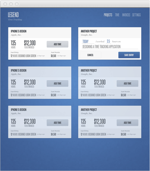
The screen shots are awful and show you can't actually design a good UX, take this as an example:
Are you drunk? What a vile, illogical, and empty rant.
OP didn't say he doesn't think it looks like social proof. He stated that it wasn't intended to function as social proof, and gave his motives for placing the logos. Seriously, I mean seriously, you couldn't have read that properly? You're supposed to be a HN poster, and you honestly can't read a post properly?
Instead of repeatedly insulting the guy, yelling about how he can't do stuff, and providing examples of his incompetence, why don't you show/tell how things could be improved?
Don't know why people are saying you're an ass for calling out glaring design flaws in a $200 book about design. I felt similarly about Sacha's book on UI, but it was only $6-$12 so it didn't seem worth complaining about. If people want to drop two coffees on something they think they'll get value from, that isn't a big deal. Additionally, the app he designed for actually exists.
This is a little different from Nathan's offering because as far as I can tell, there is no end product, nor are the examples provided good indicators of good visual design or UX.
Different from, not different than. This is a grammar tic I got from Robert Heinlein, and I'm not even sure why it bugs me so much.
That said, your selling page layout is brilliant. By putting the high-ticket options on top, you not only make the prices below them seem trivial, you evoke a sense of loss as the potential buyer travels down the page.
Oh, and the content looks good, too, ha. Seriously - I've needed a good design-for-rank-beginners book, and this one appears to be the one I want. I bought the $79 package.
That gramatical error was particularly grating. As for the price umbrella created by introducing the $250 product first, I'm unsure. When dealing with very large sums, it's difficult to make one value appear comparatively "trivial." $70 is certainly less money, but it still, unequivocally, a lot of money for a book.
I also contend this umbrella phenomenon because, with such a high starting price, it's likely to just alienate people. I saw that first price, assumed that it could only get higher, and nearly closed the page. Linear introduction of information can afford the seller ways to manipulate the customer, but it can backfire on them as well...
Fixed. I didn't realize that was a mistake. Thanks for pointing it out.
I'm not sure what works better for pricing, so I am trying this layout as an option. I did pack a lot of awesome stuff into the complete package, so I want everyone to see it.
I've been helping as a technical editor (programming perspective) to another book you might be interested in as well, http://www.design4software.com/. It's a good introduction to design for programmers of applications, whether they be websites or native.
Please remove the Facebook, Mailchimp etc logos. It really leaves a bad taste - it's a practice to show those on a landing when either the companies whose logo are featured, are using this product/service or have said something positive about it.
But after reading the line below it, it's just a mis-direction, felt almost cheated. I'd highly recommend removing it.
Yeah, this is very misleading. The icons seem to imply "Facebook used my service/book/advice", when in reality you just mean "Facebook is a web service".
Either make it abundantly clear with a big headline, or scrap the icons. They look waaay too much like social proof logos.
Edit: Looking at it again, you do have an abundantly clear headline that describes what they are. Which I didn't even see because I assumed they are social proof logos. I'd just scrap them entirely.
Agree, at first I thought Nathan had accomplished something for these companies. I thought it odd that he didn't make a bigger deal about his work for them. It was a shot to his credibility that I found he has never been involved in projects for these teams, or if he has, it's not discoverable.
It's really hard to find good concise help in this area, if Nathan's previous book: http://nathanbarry.com/app-design-handbook/ is anything to go by, this should be excellent. Purchasing now.
I'm also looking forward to seeing the response from this landing page - Nathan's normally really kind about transparency when it comes to this sort of thing. Great job.
- Get rid of the MailChimp, Facebook logos etc. On scanning it's shady.
- The whole site comes across as a bit of a skeezy sales letter. You're a designer, you're better than that. I realise this is the favoured approach from Kalzumeus etc but I find it really cringey.
- Make the bundles more easily comparable. I was about to buy but got bored scrolling up & down & up & down comparing the packages.
- I'm a designer; will this be something I can still get value from? Are you pitching this as 'design for hackers' (ala http://designforhackers.com/ ) or is it just 'stuff I've picked up from designing apps that you might like' (which I might get value from as a designer)?
The whole site comes across as a bit of a skeezy sales letter. You're a designer, you're better than that.
And this is why many designers are horrible at making websites that sell. When I sold my first book, I tried a short-form, nicely designed landing page. I even thought about doing it with my second book. But I always come back to the sales letter, because it works.
This sales-letter style seems more prevalent in eBook/video downloads than SaaS (though we've all seen 37signals' A/B tests). Reeks of a 'PAY $200 TO SEE HOW TO LOSE 100LBS IN 2 WEEKS'.
edit: actually, with no offence intended - your book's website is one of the ones I was thinking of. I was seriously considering buying it from the HN title but was totally put off by the website. I'm sure it's a fantastic book and I'm sure I'd benefit from it, but the website left a bad taste in my mouth.
Actually, while I'm on your site, let's go back to your App Design Handbook.
- Better layout; good that it's all on one page. Long scrolly site (Lost World's Fairs etc etc) are great but this is better shorter.
- Similar to the Facebook/MailChimp logo issue with your new book, why do you have a quote that has nothing to do with your product? Makes me think you're making up for a lack of testimonials.
- Highlighted differences between packages are better than your new book. But still would prefer side-side comparison.
- Difficult for you to give a sample of premium code included (the '10 Objective-C Snippets' and 'Xcode App Design Project') — I've got no idea what the quality or scope of this stuff is. Not sure what the answer is but that would be why I don't buy the $169 package.
Hey everyone, this is my latest book on designing web applications that are easy to use. I've spent a ton of time not only on the book itself, but also on the video tutorials and interviews.
Interviews are included with:
Ryan Singer from 37signals, Sacha Greif from Folyo, Trent Walton from Paravel, Sahil Lavingia from Gumroad, Jarod Furgeson from WebWaitr, Brennan Dunn from Planscope, Patrick Mackenzie from Kalzumeus, and Jason Fried from 37signals
These are the guys who have inspired me, so I am honored to be able to include interviews with them.
The whole "these people are experts in CSS/HTML" shtick never works for people who aren't already decent at web design. Instead of listing their companies, mention some of the projects they've worked on.
I know who many of these people are, but that's because I have a lot of web design books on my self with their name on them.
I try to quickly explain what each person has done. They are all awesome people who have put out some really fantastic work. Honestly, I am expecting that people will recognize the names (like you did).
Bought within minutes! Even though I don't do iOS stuff, I bought the Designing for iOS Apps book to learn some web app design. I've been all in on a sequel book specifically for web app design.
I will be purchasing this. $200 is nothing for the amount of value that can be created in just one person's life when UI + UX skills are applied. Not sure why all the negativity in this thread.
>That would be very expensive. Looks like at least $30 per copy.
How do you reconcile this with your previous comment[1] in this thread:
My target market is people who are serious about web applications. In an industry where it isn't hard to charge $100-250 an hour for design or development work, $200 for everything included doesn't seem like a lot.
? That statement doesn't even apply in this situation. In that statement he's referring to how he's value-priced his product at around the hourly rate of a solid app developer, so purchasing the book (that he's collated together through experience and time) is really not that expensive, especially if you compare it to doing it yourself.
In his second response, he's saying that he'd rather not pay $30 to sell a book that he (was) selling for $29 (now $39).
One statement refers to value of a product to his target market, one refers to simple profit calculation on his own product.
$31 in expenses is a lot for a book that I am selling for $29. I'm not into losing money on every sale. Even if I bumped up the price to $50 for the printed book that is still a crummy margin when you factor in carrying inventory, shipping, and everything else.
I was following the release of this book and will probably buy it shortly. I think the reason that a lot of people are being so critical is that it's UX. I work in UX and everyone is (or thinks they are) a UX "designer". I looked at your sample pages and web site and thought I could learn some things from you. I also thought it looked great, so I don't think you have anything to worry about.
No one is going to do things exactly the same and your book doesn't come-off as being a forceful entity on rulesets, which is nice.
I would also like to see some other pricing options - mostly because I want the book and PSDs only, but I don't see anything wrong with your pricing model. It scared me at first but I didn't see/notice all of the extras that you had for sale with the book.
Anyhow, good luck, I can tell you spent a lot of time putting the material together. This is a tough crowd but in the end most criticism, even if harsh, will hopefully be constructive.
Enjoy the sales and focus on the real UX designers/developers ;)
I think you should take another look at your package overview images. The package for $79 and the package for $199 look about the same from a glance. I see that the packages lists different contents below but I think it should be more obvious from the large images. Nice work though, seems nicely done.
I think it partially has to do with the scrolling. You can't really compare the 2 packages without trying to scroll back & forth and keeping the other one in memory. You should probably add a grid at the bottom listing all contents on the Y axis & your packages on the X axis. The price is too high to not really think about the purchase for most people and that would make it much easier.
Very bottom "So, are you ready to buy the book now?"
But no link/button/call to action - I'd need to scroll back up and parse out which action to take from the visual stuff above. Wondering if you'd see more conversions by putting a purchase link there too (or perhaps you've already tried it)
To be fair, $200 is really not a lot of money. For all the contents, videos, interviews, samples, one can imagine how much effort being allocated for this. Being famous doesn't entitle someone to be able to charge expensively. Likewise, nothing is stopping anyone out there ("nobody" or not) to charge the price he or she wanted to. This is what we call internet, it's completely free market. No government or regulatory body is going to say "Hey Nathan! You are nobody, stop charging people a bloody $200 notes for a piece advice." Let's put some angles of perspective in, if he successfully sells 1000 copies at $200. He will make $200k revenue. Deduct that with the cost of his labor, his lost opportunity to work on his apps, marketing fee and the support time cost. He will probably pocket 30-40k pure profit. What if he has to follow what people say to price it lower at $20. Selling 1000 copies will barely cover his cost. And where are you going to find 1000 people who will believe this $20 crap going to give you top notch advice on delivering amazing web apps UX and design. Charge premium is a good start. Keep improving the content is a sure way to gain you the loyalty of customers.
Back to the odd marketing strategy. Why show it here? Why HN, really? Most will simply want something quick and simple to show the idea behind their hacks to the community. We are frequently being shown unfurnished prototype (indeed twitter bootstrap half the time). Anyone really serious about building well designed and engineered UX web applications will probably have a well funded startup with specialist UX designer onboard. Or someone must have been a long time practitioner of UX to be bothered about putting much focus on UX. It's not as simple as reading a book, listen to an interview, you become great in UX. It's only through years of experience, going through iteration after iteration of UX design tweaks, you will have a basic idea where to lead the good UX direction. A long the way, there are still huge chances to make UX mistakes here and there. Too simplified, or too complicated. Too plain, lack of creative input. Too much boring UX treating every users as dummy as they can. I am sure it will be hard for the community here to start bothering UX before getting their hacks done. And worst, the next hacks are waiting ....
I got the newsletter via email and headed to buy the book where I reacted same as the majority of commenters on HN.
After checking the options/prices, I am going to put that on hold for now. Good luck though, I am sure you've put a lot of effort into this.
Long sales pages convert. There are a few reasons, one is that long pages give you the chance to pre-empt and answer each and every question or concern that the customer might have. The other reason is that merely by spending a long time reading your sales page, that person has made an "investment" (of their time) in what you're offering, and now they want to get something for that investment.
You're right. It is long. Really I wanted to make sure everyone's questions were answered. I figured for those who were interested in buying, they would want to know everything about the product.
Also I wanted to show everything that was in the product, and with all the videos and resources, that takes some space!
Long sales pages are able to present the pain the reader feels, detail the solution they need, provide an offer, establish their authority, highlight customer success stories, counter objections, and reverse risk. (This is all yanked from Sean D'Souza's book, the Brain Audit: http://www.psychotactics.com/the-brain-audit-marketing-strat...)
It would be hard to do all of this with a short sales page.
I would place buy buttons with a blurb about your money back guarantee at the top right of the page. Ideally I want to know most of the information that will influence my purchase above the fold or get to it easily via links.
Nice! One thing I'd suggest for the landing page is a floating bar at the top that allows you to skip around the page and shows your current position - it's pretty easy to get lost on that huge landing page.
Suggestion, add some sort of image/logo beside the main header statement "Are you scratching your head wondering why people sign up for your application, but never come back?". Makes it more believable.
This looks really fantastic, great job. How long will the promotional pricing be available? I want the 'complete package' but won't be able to stump up the cash for a couple of weeks.
I was casually browsing the site, but honestly it wasn't until I came back to the HN comments that I realized there was more than one package with more than one price.
Because I wanted it to stay separate from the rest of the WordPress theme on my site. That also makes it more portable if I need to setup the landing page on another domain (if traffic cripples my main site).
Since it is just a single page site, I didn't feel the need to do separate files.
I should add that I didn't code it. Got too busy with the book launch so I hired it out.
For what its worth there is 1 theory for SEO that the code to text ratio on webpages (not apps obviously) may play an extremely minor part in ranking. If you served the css from a cdn the page would be faster (rank higher) & better optimized (rank higher).
I can't say it will make a difference, but it might.
> Previously I led the software design team at a local startup, but in the last year I have been working independently designing and developing my own apps.
After seeing the $200 price tag, I expected to read something along the lines of "My web apps have been used by over X million users", along with a few examples. Or maybe "I built the websites for these well known companies". Since that isn't the case, the next thing I looked for to establish your credibility was reviews. Hmm, also missing.
For the price of the book alone ($29), I could watch 100+ hours of tutorials on a site like Lynda or Tuts+ from a variety of developers with similar experience. I'm having a hard time verifying that the value of the resources matches the price tag.
Sorry if this seems overly critical, figured you might want the honest opinion of a hesitant customer who could potentially be converted. I may still buy one of the packages after I read through your blog some more.