I wonder how much of Stripe success is due to their gorgeous UIs and overall design, I hate when people say "Design is nothing, content is what matters..." and I love when companies like Apple and Stripe demolish these stereotypes. Design is AS important as content, great content & features will be unnoticed if they are buried under outdated and unfriendly UI design.
I think this confuses causality to an extent. Aesthetic design has to be a natural extension of the underlying product.
A beautiful website for Porsche/Apple/Stripe and other highly-regarded products inspire confidence.
Apply this same design to Dell's website and people won't take it seriously.
In my recollection, Stripe's focus on aesthetic design didn't begin until the core problem of simple credit card processing for developers had been solved. Once they gained trust with their customers as a brilliantly-engineered product, beautifully-designed UI's followed.
I don't believe gorgeous or ugly UI came into consideration when we switched payment system for my SaaS to Stripe. Our main consideration were ease of integration, payments transfers from Stripe to our Bank, and User payment dispute resolution. I doubt it we ever check Stripe dashboard and use Stripe App since the integration. Only time we go look at anything on Stripe site is when we need look up something new we are trying to integrate or user payment related issues. I would love to know how Stripe users are using the dashboard and other UI oriented stuff beyond APIs. What values do these thing add to users' business.
However, the things you love about Stripe - like its ease of integration - likely come from the same dedication to quality and user experience that went into the design. Amazing UIs are often an indication of a well-thought out product in which a lot of time went into all the details, including UI and functionality.
A product that cuts short on presenting a polished product on the outside, may very well have the same ugliness to its internal components.
Or, as sometimes happens, 90% of the effort went into the design, and the product itself is crap. That happens too. ;)
If this were true, we wouldn't need to be constantly reminding people to not judge a book by its cover. That said, great novels have been judged so by their content, not their cover. So it seems that the whole of it is more complicated than any part.
Maybe something like: It must look good to get attention. It must be good to keep it. But if something that looks better comes along, it will steal attention, at which point you can only recover it if you remain better.
Not sure you mean the app or in general, but I opened this webpage in landscape mode on an iOS device and it looks comically broken, with overlapping elements, text that can't be read and so on.
I'd rather have a website that works and doesn't have a gorgeous UI. Sure, ideally we could have both, but these modern web UIs are quite unreliable in my experience.
> I hate when people say "Design is nothing, content is what matters..."
Design is absolutely essential... but only if everybody else is doing it.
(In that sense, it is a bit like advertising.)
Design and advertising are distorting the free market. We cannot see if one product is better than the other by looking at its design. We can only conclude that one company has put more effort into the design of a product, than another company and from there we often end up with the fallacy of concluding that one product must be better than another.
However, advertising and design nowadays only show that one company has bigger pockets. Or, in other words, money is spoiling (through design and advertising) the evolutionary properties (in terms of quality) of the free market.
From the moment that you acknowledge that red text on a blue background is hard to read and makes a product genuinely worse, you must acknowledge that the design of a product is a legitimate part of a product.
Design and usability go hand in hand, and _of course_ a product's usability is a genuine part of the feature matrix of products. Sure, some design differentiation is "marketing" , but you also have designs that genuinely make a product better/worse.
I don't use Stripe and have no reason to, but a) that demo of the UI on the page is fantastic, and b) if that's what the UI is actually like, it also looks fantastic. (I mean, it looks like it works in a way which is fantastic. And visually it looks good too.) Good on 'em.
I never have used a Stripe product (although always wanted to) nor will I have any need to in the near future but I will always click a new product announcement from them. They are just so beautiful and consistently so. Sometimes I feel like the design takes over the actual product announcement too. The discussion on HN is usually about how great their designers are. Anyway, this looks like another great, polished product from Stripe. They are unstoppable.
What's wrong with this? The boxes aren't rounded? It uses a boring font that's already installed on my computer?
It's laid out logically. You can tab between form elements. It's clear what each field is about. It's not squashed together, it's not spread out too much.
I'm also not a Stripe customer, but back when I went to check out how it worked, the most impressive thing was being able to skip the sign up and jump directly into a usable product. Spend some time setting up your account. If you like what you see, and only then, provide your email and password to create the account (of course keeping everything you've set up).
It's such a simple thing to do on the backend, and yet I'd never seen this before. So simple to implement, but gives an amazing first impression.
The Stripe web dashboard is nice, but it's completely unresponsive. Why are they developing native apps instead of making their main product mobile-friendly?
I hate responsive websites, I prefer to use a full sized version on my phone. Most of "responsive" websites hide vital functions from a smartphone user, I hate that.
Some people do it and it annoys. But it can also be simple things like: Big screens see 2 1/2 screen wide tables across, small screens so the tables under each other. No hidden info either way, just scaled well.
I think good responsive website is the ideal end state. I do not want an app for every single thing I visit. A few important things sure. If stripe was my main activity, sure! But if I am just using it to watch my monthly sales number... rather have a good mobile website.
You are the first person I've ever heard say that they hate responsive websites. Unless you're playing around with your window size, you wouldn't even notice if they adding responsive features to the dashboard. Sounds like you just hate poorly done websites.
Is a site truly responsive if it delivers a lesser experience on mobile, even if it does happen to change the layout so that the experience it delivers, regardless of the lack of content, does work on mobile?
Because I don't use iOS and changes to the web dashboard are guaranteed to be available immediately on my phone, not after they get around to updating the mobile app and getting the app approved.
Because you may not easily convert all users to download your native app(s) across various app stores. Mobile Web can address the LCD, regardless of device (assuming your users have phones with browsers).
Even the text shimmer on the "slide across" was done well. Animations are an excellent way to convey information in a digital medium and Stipe make good use of them.
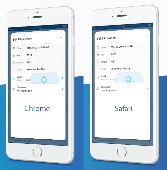
nice design, but i wonder if their design team has any non-retina machines? the anti-aliasing in the tilted phone UI is pretty bad in Chrome on a non-retina display.
It's actually an implementation issue and yes, I agree it's unfortunate. The problem is that the video is rotated in 3D in CSS (so we can reuse the same video without the fancy 3D effect on smaller displays since the page is vertically responsive) and unfortunately, the result varies depending on the browser (it looks much better on Safari, for example).
Chrome on iPad in landscape shows the phone, non-tilted, with just a black screen. I had to check the screenshot someone else posted to see what it should look like. In portrait, the phone is tilted but still nothing displays on the phone.
If any of the Stripe iOS engineers are here, just wondering what your rationale was for using a card based layout for the app? The alternative being the standard nav stack. Serious question.
Your card layout sure is beautiful and the animation is nice but how did you decide it was worth it given some of it drawbacks (users used to the standard nav stack, less screen real estate for content, etc).
If you search for "Stripe" in the iphone app store it is nowhere to be found. Among the results that do appear are "LoL Camera", "Fruit Shake", "Color Lines Free". Apple really needs to improve their app store search.
edit:Seems to have been related to background loading (opening link in new background tab and then not clicking in to it until after it had fully loaded)
As always, product page announcements are gorgeous. But does anyone feel the web dashboard is severely limiting? For example, getting simple graphs like YTD, Last Month, This Quarter... etc currently it's all manual http://cl.ly/image/0y1I0Y1X450D
And ditto on simple KPIs/analytics e.g. % increase of new users this week vs last, ARPU, Q/Q... I know there are 3rd party services that focus solely on this but it just seems like such an easy add; am I missing it somewhere in dashboard or is this really not a priority?
I was using the dashboard last night and felt certain that you guys must have some kind of overhaul in progress. Looking forward to being surprised by it one of these days.
The one chart I wish Stripe would put in their standard dashboard is charges month to date vs. previous month to date. It's arguably the most important metric for SaaS. I always have two browser tabs open to measure this.
Edit: Looks there is some exiting stuff coming from PC's comment. Looking forward to it.
The library is concise and easy to reason about. Did you pull this out of the Bitcoin landing page?
I just started using the lib for a client last week and I love the syntax. The code is starting to get a little unwieldy, how do you structure your animations typically?
Control provides a number of services (business intelligence, analytics reporting, etc.) in addition to mobile apps to view your Stripe account details. We let Control know we were planning to build an iOS app in September of 2014 and we plan to continue to work with and support their efforts to build on top of Stripe's platform.
More broadly, we want to balance being good ecosystem stewards with building the best product for our businesses. Occasionally, what we do will overlap with what others are building. When that happens, we'll try to give as much notice as possible.
If you have any questions about this, please drop me a line (cristina@stripe.com). We want to ensure we're building out the Stripe ecosystem to make our partners successful.
Awesome, the mobile app Stripe has needed for years is finally here. I'm most excited about push notifications (new customers, charges), and a quick overview of transactions on the go. There have been entire companies (successfully) built on just sending Stripe notifications, now it is native in a mobile app.
Cannot sign in the app after installing. No error messages. Nothing happened after clicking the Sign In button.
We've been using Stripe for a little more than half a year now. While the product and design is top-notch, the reliability of the service and speed of bug fixes could really use some work.
How convenient, since I just started using Stripe this past week :) Control -- the app I had been using -- seemed great, but I have to imagine this will trump, especially considering the amount of polish and attention to detail goes into every Stripe interface.
I feel bad for all those third-party apps on the AppStore that probably do the same thing. They filled a niche before Stripe could build their own solution but now, will they just fade away to obscurity?
Nice, I've been secretly waiting for this, also because I knew that the design and usability would be convincing. Stripe delivers once again.
However I will have to stick to a third part competitor[1] for a while, until the following features are implemented (I imagine they are on the roadlist):
1. Some sort of app protection, e.g. a pin code
2. Multi account login
The perspective transform on the video really makes it look bad. Jaggies on the thin lines and text and tough to read. It's worse in Chrome than Safari, but still bad in either case: https://pbs.twimg.com/media/CHE07a-XIAARlY4.png:large
I'm not sure about wanting to see payment data on the lock screen. Looks like it includes a payment amount and an email address. Isn't that borderline privacy issue? I wouldn't necessarily want my email address displaying on people's lock screens. Or am I just being paranoid?
All shopping cart software I know of sends the store owner an e-mail about each purchase with the customer's e-mail and payment amount. E-mail already appears on my lock screen.
It's definitely not a privacy issue but perhaps a security one. I know I wouldn't care myself using it but I would be aware that a lot of people would. I'm developing another login screen here today and part of me is wondering why we secure passwords on single user devices like the iPhones but not necessarily tablets/laptops which can often hook up to external monitors or projectors. I think the iPhone security constraints can be a little more lacking than tablets and laptops in this way because they're a little more intimate. Texts messages already show up in lock screen too and texts are considered private by most people.
Getting greedy: when can I sign into more than one Stripe account at once?
The app is great. Integrated right with 1password as well, and when I went to Authy to copy my MFA token, it auto-pasted it when I returned to the Stripe app. Normally signing in with MFA is a pain, but this was super great!
Hi I am Kathryn! I am the founder of Control , a Stripe partner, and the company referenced in this thread.
First off, I would like to point out an obvious fact : this is my first post ever on HN. I have observed /admired all of the great discussions on HN for years and have never felt as though I have had anything useful to contribute (or maybe I was a bit intimidated :) However, a couple people messaged me about the thread that has been materializing here- so here I am! I hope I can add an interesting or insightful perspective.
Yes, Control has an iOS dashboard for Stripe merchants. And an Android app. And a web app , and we have an iWatch app in development. We have a number of areas where we are building out a set of capabilities for businesses to manage their payments better. In fact, we have a number of really cool ideas in our pipeline I think anybody who manages payments will find very , very interesting. Contact me to see our roadmap !
I have known that Stripe was building an iOS app for months (as Cristina pointed out , since September 2014) and I believe this is great! I think a free app for Stripe customers looking for very simple functionality is a smart move by Stripe. And the design is sensational, well done!
At Control, we are focused on building out many more capabilities that I believe businesses will find valuable . For example (just to give a flavor of our thinking):
- Real time alerts on transactional behavior indicative of potential fraud occurring
- Expanded CRM tools in iOs, Android, and web
- The ability to manage Stripe, PayPal , Dwolla, and more from 1 app
We have a number of payment platforms in our radar we want to build business apps around (we already support Paymill in Europe and nearly done integrations to PayPal, Conekta and PIN Payments). However, Control deliberately built around Stripe first because:
a. Stripe/Cristina has supported our business model from Day 1 and
b. I truly believe Stripe's approach is the most significant innovation to happen in the payments industry in the last 10 years, because of their philosophy of opening their APIs to the broader developer /app ecosystem. We love Stripe and we love being able to add value to their customers
We are proud to be a Stripe partner and hope to continue growing and innovating alongside with them.
I should point out that one of our investors /advisors is the Hootsuite CEO, Ryan Holmes. The best advice Ryan gave me was not too worry too much about the prospect of Stripe releasing a free app, but to keep innovating and building distinctive value. Hootsuite's business wasn't materially impacted when Twitter launched their free app . I think this is a good analogy of our position.
Hey Kathryn, Zac from Pin Payments here. Stoked to hear you're working on supporting us! Do reach out if we can help with anything at all. (It's our first post here too ;)
Does this app provide a native onboarding flow if I want to use Stripe Connect in my iOS app? This would be great for mobile-only applications that provide payment functionality.
What do you mean kudos to their motion guy? Is the iPhone animation not merely just a recorded screencast of the actual app functioning as it does natively? Or have I been had by a ruse -- was the animation made in an animations program?
(I work at Stripe.) Seems like the App Store takes a bit of time to refresh everywhere. Check back in a few hours, and if you still don't find it, please let me know!