I would not call this a dark pattern. You browse backwards through your personal library hierarchy, what happens when you reach the top of your hierarchy? It takes you to the entire world of music. Your personal library is a subset of the world. Sneaky? A bit, but hardly a "dark pattern". It isn't being nefarious about it, just saying "Oh, so you browsed all the way up and didn't find anything you wanted? Let us help."
That is an absolutely ludicrous explanation. Nobody is using the iPod app and expecting to get to the store. That short cut is purely there to collect accidental clicks. If I wanted to purchase music, I would have opened the iTunes app.
I have personally hit that button accidentally many times while trying to get back to the albums view and waiting for the animations to finish in exactly the way this article describes. I did not want to go to the iTunes store! I just wanted to pick another album on my phone and now I have to double tap the button and navigate back to the music app.
I'm sure you're equally happy getting Viagra spam in your inbox, because everyone likes sex.
The core issue is it breaks a core UI convention, clicking back and stopping at the beginning, just to push a few more people into a shopping portal. Coming from UX, that's probably the most brazen abuse of Apple's previous good name in design and user experience.
Also, where else are you going to put this button? The screen has limited space, and you want it near the top. You put it as a link in the Table, but that makes it strange and out of place with the other contents of the table. And if it is near the top it is in an even more awkward position.
I agree. I think the real issue is a UI "anti-pattern" that is implemented throughout the iOS UI. It's a throwback to the Windows Start button, but instead of a start button... No really, it's just like Windows 8 menu. But it falls short because there is no "control panel" list of icons, instead a deep menu.
This is a UI concept that has had a lot of usability testing on the Desktop. Personally, I feel tapping through hierarchical menus on a mobile device is just the wrong way to go about organizing/using the system.
I want to call particular attention to the author's point about Apple's pie chart.
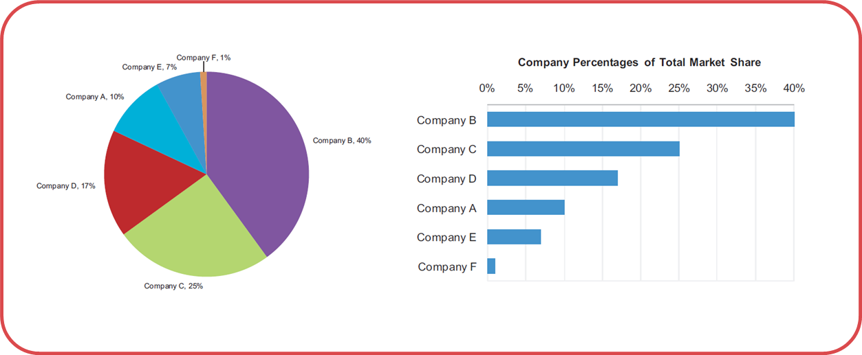
Not only is Apple's pie chart used for telling lies here, I would argue that all pie charts are used for telling lies.
The only thing a pie chart gives you is it tells you that everything in a category adds up to 100%. It doesn't tell you what 100% is, or why 100% is good, or bad, or let you compare across charts, or set goals.
You can accomplish this same thing with a bullet graph, developed by Stephen Few. You make a bar chart, then put a line through it to represent your goal (or 100%). Then, it's simple to compare multiple categories and model very complex information in a simple to understand way.
So remember this: The next time you see a pie chart, know that someone is lying or trying to appear more impressive than they actually are.
The worst part about this particular way of graphing information is that it's so ingrained in our culture (it's taught in Kindergarden), that people don't even understand that they're lying, even when they are.
I can understand how pie charts can be manipulated to show whatever the presenter wants to show...
However I fail to see how they are lying because they used a pie chart... back in 2008 they are saying that Apple had roughly 20% of the market share of smart phones.
They are vague in explaining whether they are measuring - devices sold, devices in use, devices pre-ordered... however that would be the case whether they used a bar graph, line graph, or just gave the raw numbers.
Here's an experiment: Get a random set of pie charts without labels on them. Get a large group of people. Now get those people to go through the pie charts and add what % of the pie chart they think each slice represents.
Now, get a set of bar charts and do the same thing.
In both experiments time the participants. You'll need two groups, a group that knows they're being timed and one that doesn't know.
What group was more accurate? What group was able to complete the exercise faster?
The reason that using pie charts is, in and of itself, a dark pattern is because the results of this experiment support bar charts as a more concise, more easily understood way of communicating information. In other words, the only real reason you'd use a pie chart is to obfuscate information. Or, well... to lie. If you're just using it because you don't know better, then you're negligent and misleading people without even knowing it.
"then you're negligent and misleading people without even knowing it."
Is that their fault? I don't entirely think so. You might be able to claim they should have done the research before choosing that type of graph but the majority of people are not even going to give pie charts a second thought.
If there was an active campaign against pie charts and more discussion I might find fault in that persons ignorance to the matter.
Yes, pie charts are poor visualization tools. But most people who utilize them are simply unaware of their shortcomings and so they aren't 'lying' (a lie requires intent).
The misuse of language is another way to mislead and confuse people -- intential or not.
We should strive for accuracy in words and charts!
I agree there is something wrong with this button. Without formalizing my thoughts until now I remember feeling disturbed by its presence because you pop your views, then expect to be at the top of the hierarchy of your library and then somewhat feeling contradicted by the presence of this button. Of course this is not a big deal, but it's a real inconvenience.
I agree, and I particularly agree with the point that your music is a subset of the world, and this back one more is the music store. My original thought on it was that you've reached the top of the hierarchy, so that button becomes free game for doing something else. If it were truly a dark pattern, it would have a back arrow and not just be a button.
That graph seems pretty clear to me. If anything, the way it's tilted maybe makes the Apple segment look a few percent larger than reality, but certainly not enough to get upset about. Not to mention that they clearly label the segments with actual percentages.
"I have a feeling, this is just the tip of the ice-berg." A little over-dramatic at the end there.
I fail to see how this is a "dark pattern". Apple is a company that stays in business by selling you things; they are not your friend that builds great products and services and gives them to you for free. Of course they will create things aligned with their interests. Is this manipulative? Sure, it can be after a point, but not this example. Are there examples of manipulative UI patterns? Yes. Microsoft forcing you to use IE comes to mind or pre-checked newsletter signup checkboxes.
I wouldn't call it a dark pattern, it's just annoying as hell. I think Apple does a decent job about clearly drawing the line between stuff you have and stuff you could have.
The second example is a stretch. My brain, being used to seeing and interpreting perspective, has no trouble realizing that the Apple segment is nowhere near as large as the largest segment. I suspect most people with a field of view larger than their retinas will have no trouble seeing this. The author might have a point if the perspective was much more exaggerated, or if there weren't clear numerical labels on each segment.
OK, but I fail to see the larger point in searching for delicate and subtle manipulations of the user on the part of Apple. This is the company that tried to sell its iPhone 3G with blatant and outrageous false advertising: http://lee-phillips.org/unslow/
I guess the question is difficult compared to what? How do you go about limiting ad tracking on Android devices?
As mentioned in another comment, the setting was buried in IOS 6, in iOS 7 it is in the Privacy section, has a link to a page that explains what the setting can and can't do (you still get ads but they won't be as targeted) and also let's you manually reset the advertising identifier at any time.
I'm not aware of anything similar or better on any platform.
Oh I agree, I think that it's all a mess and that iOS has one of the better (if not best, I am not familiar enough with the other platforms to comment about their ad tracking settings) interfaces to manage your ad-related privacy. As I mentioned in my reply to the other comment I was neither advocating for or against this post or the one I linked. It was just the first thing that came to mind when I saw this post.
Second level (Settings -> Privacy -> Advertising) but I agree it is better than where it was before. Please note that I was neither advocating for or against this post or the one I linked. I just wanted to add a similar link to the discussion. Thank you though for letting me know the location has changed, I was not aware.