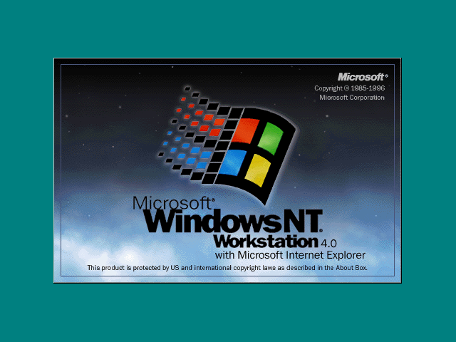
A clean, simple, elegant logo, completely ruined by the honking TM and (R) injected by the lawyers. The bizarre presence of two separate legalese-related sigils on a single logo makes it impossible to miss. Also makes it clear who is running the place.
It wasn't uncommon for Microsoft to have their name mentioned 4 or 5 times on a single screen, alongside copyright symbols, trademarks, and other crap.
They have sent letters to people using "photoshop" as a verb, especially in a general context where it's not clear that Adobe Photoshop is the editing software.
Bic (pens) write to stop people using Bic instead of ballpoint. (Very successfully it seems, that's not a use I'm aware of.)
Hoover try to stop people using hoover as a verb too.
Google used to try to stop people using "google it" to mean "web search it".
They have to try to protect the mark, otherwise there's no point them having it.
But it can lead to the loss of the trademark if it becomes a common word. Anyone can brand their product with it.
This happened (or at least went to court) with Hoover in the UK I think. Hoover had become the generic term for a Vacuum Cleaner and so any company could make and sell products described as Hoovers (or at least it was an open legal question).
This means it is far from crazy to defend a trademark from generic use.
There is no danger of these companies losing their trademark, anymore than Apple the iPhone maker is in danger of losing its trademark either because the term Apple is associated with other commercial products, e.g., Beatles records or because it is also a common word.
The companies are worried about loss of "uniqueness" (aka. "trademark dilution"), which is a special form of protection that famous and unambiguous trademarks get. Now that the Google trademark is considered unique, you can't start a Gourmet Google Goulash restaurant, even though there is no risk of consumers being confused about who they are dealing with. The law is worried that Google's brand strength might be diluted by their brand managers not having the stage completely to themselves.
I think this whole area of law is fairly recent - Wikipedia says it grew out of anti-cybersquatting efforts in the mid 1990s.
Trademark dilution is different. You can lose the ability to enforce trademarks that become the generic word to refer to things, on the reasoning that people shouldn't be able to have monopolies over the basic usages of language.
This is why average consumers can't tell the difference between an "iPhone" and a Samsung phone -- they use the name of a popular instance of a thing to refer to all instances. A soda is a Coke, a tissue is a Kleenex, a photocopy is a Xerox, an acetaminophen is a Tylenol, an ibuprofen is an Advil, etc.
Microsoft really don't need it. It would be very hard to argue in court that you released a product called 'Windows' without knowing that a similar product from Microsoft already exists, or that you didn't know that your Windows logo is the same or similar to what Microsoft produce.
Microsoft really should just have a subscript in the EULA or splash screen with "Microsoft® and the Windows Logo ™ are registered trademarks of Microsoft Inc. 1 Redmond Way, Redmond, WA, etc."
That is what startups should do as well. The best way to estalish your intellectual property is through soft enforcement, just sending out polite letters whenever somebody uses your marks in their own products. If they don't change, then pursuit further, but this works well with Facebook and in a lot of other cases.
Microsoft is probably aggressive about the windows trademark as it is a very generic trademark and could easily be revoked if not defended vigorously.
Even in relation to operating systems it is generic - think "window manager". Because of this it is very easy to argue that Microsoft should not have been allowed to trademark such a generic term.
A large part of it is probably a CYA attitude by the legal department, too.
If they're too conservative, and legal notices are featured prominently without reason, the price is paid by Microsoft as a whole having mediocre branding, and the legal team is not accountable. But if the trademarks slip away because they've been too liberal, heads will roll.
Thus the incentives are pretty clearly stacked up for the lawyers to insist on protection that minimizes risk to a degree that hurts Microsoft as a whole.
The trademark symbols can provide constructive notice of the registrant's ownership of the mark, and can be used to support enhanced damages for willful infringement which may not be available in the absence of marking.
I actually like the visual appearance of these symbols in some logos, including this one.
I believe in this case I like it because the ™ slightly reinforces the 3D effect, and because it's a rather bad logo to begin with. I.e. almost any change is an improvement and the small pictograms give it a bit of an "organic" touch.
I think TM is what you put prior to the mark being approved as a registered trademark by the USPTO. (It's analogous to "US Patent Pending" but for trademarks.) So eventually there will be two (R) on that logo.
Maybe Microsoft could make the whole logo out of (R) symbols. Then the ones inserted by the lawyers will fit in.
TM doesn't mean anything - a trademark is either registered (and therefore enforceable) or it isn't. You can slap it on pretty much anything you want, it doesn't mean that whatever it is attached to will become a registered trademark, or even that the owner has filed for registration.
I can't speak for the USA or anywhere else but in Canada TM means something. Common law trademarks do come with some rights to protect your brand, Registered trademarks come with more. It's been a long time since my IP Law class but I beleive TM allows protection against business in the same industry from using your trademark in such a way that it could be reasonably confused for yours.
TM still doesn't mean anything in a legal sense - if you're relying on the common law protection then it doesn't matter if you put the two letters next to your logo/brand. Putting TM on doesn't mean you have any protection, and leaving it off doesn't mean you have none.
It suggests that the company has some rights to the brand and might act as a deterrent to others using the brand without permission (especially as most people probably don't understand the difference between registered and unregistered marks).
Very small type at the bottom of their ads. Despite what people think, you are not required to stick a trademark sigil right next to your mark. I have been having this argument with people for nearly 20 years, and don't blame the lawyers so much as the managers who won't take the time and effort to actually think about what the lawyers are telling them.
I've also heard (from MS lawyers) that it's only important to have this at the first point of display of the logo, such as installer or splash screen. Does not have to occur everywhere.
Then that example can be applied to the Surface tablet* and any manufacturer's laptop -- no (TM) there.
But even then, what makes a hardware product different from an advertisement or a software? As far as I know, there's no legal text on the bottom of these hardware products either.
Check out Ross-Whitney Corp. v. Smith Kline & French Labs, 207 F.2d 190, 99 USPQ 1 (1953). Might provide some support for your position if you have to argue with the lawyers ;)
I'm not too keen on trademark law, but as I understand it the point to including an (R) symbol is to provide notice that a mark is registered with the USPTO.
Why does notice matter? It doesn't excuse infringement if the (R) is missing. However, if you infringe on a trademark, damages are due from the date that you know or should know that the mark is registered. So if you register a mark for your obscure brand of shoe trees or whatever, it makes sense to include the (R) wherever you can.
Now who doesn't have this problem? Apple, for one. Unless you've been living under a tree for 35 years, you know that if you sell computers with an Apple logo on the front, you're infringing on a famous registered trademark.
Yahoo also doesn't have this problem, so who knows why they felt they needed to include the (R). During the original dotcom bubble, some companies were notably overzealous about IP, so they may have gone all in at the time only to revisit it now.
It might just be me, but the (R) is practically invisible when looking at the logo on the whole. The TM is much more obnoxious, but I can see why they might be hesitant to use four rectangles askew without it.
http://i50.tinypic.com/15oidfb.jpg
A clean, simple, elegant logo, completely ruined by the honking TM and (R) injected by the lawyers. The bizarre presence of two separate legalese-related sigils on a single logo makes it impossible to miss. Also makes it clear who is running the place.