The guy is the same that the code_swarm visualization:
http://vis.cs.ucdavis.edu/~ogawa/codeswarm/
If you didnt see it before, go there and watch the impressive videos about eclipse, apache, python and postgres.
I do not think magnitude of change can be readily computed. It certainly is not measured in characters, bytes, or lines. For example, one checkin might toggle a #define that controls thousands of lines, another might just reorganize the order of declarations in a file.
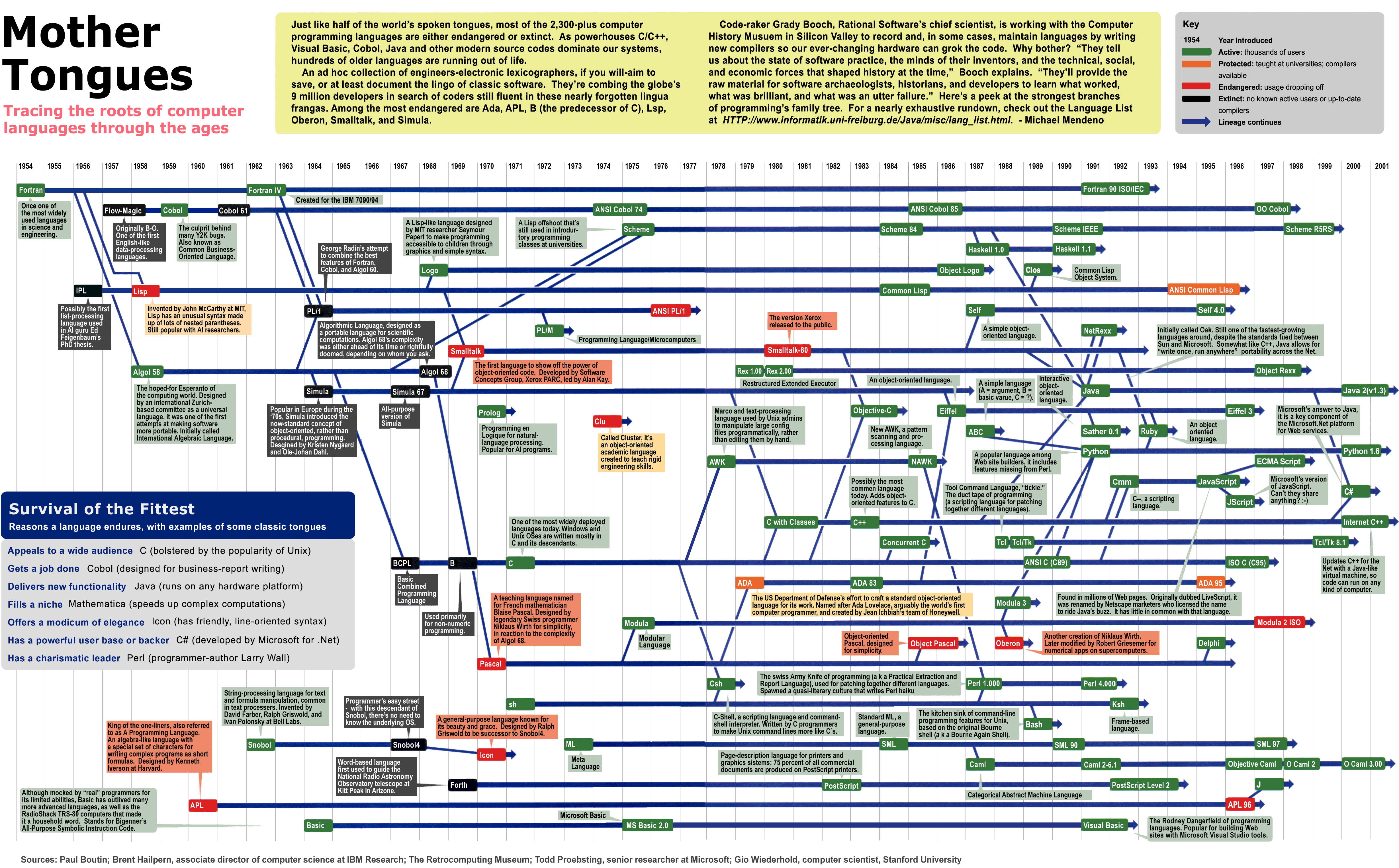
There was a huge chart of the history of programming languages at my university. It showed which ones influenced others, and I'd look at it often. Oddly enough I didn't pay much attention to Python at the time focusing on all the lines coming into and out of Java. I've since discovered Python and really wish I could see that chart again. While this is very different it gave me a piece of that magic again. Thank you for posting this. :-)
Python is fairly conservative; as far as languages go, probably not the most interesting, which is exactly its charm.
I would group Python with Pike and Icon, as 2-week programming languages. It takes about 2-weeks of practice to start writing useful, sophisticated programs in them. Icon is the more interesting one of the three, it's a modern SNOBOL dialect with generators.
Not really too helpful that it only goes to 2006. It would be interesting to see how this looks with PEP 3003 in place (the moratorium on syntax changes) — maybe not much different, but maybe a lot different…
The chart excellent for visualizing one's contributions against and general activity. Would it be possible to generate a similar graph for other mainstream languages, gcc, and linux?
Wonder if the post-2005 spike would be similar for all interpreted languages, or just python.
The guy is the same that the code_swarm visualization: http://vis.cs.ucdavis.edu/~ogawa/codeswarm/ If you didnt see it before, go there and watch the impressive videos about eclipse, apache, python and postgres.
The guy is using processing.