From an accessibility/localization stand point, icons+text everywhere seems to be ideal.
Also, I disagree with:
> This posture lends itself to a practice where designers have an attitude of “I need an icon to fill up this space”
Sure, that does technically happen, but is in no way preventative or mutually exclusive with the follow on thought:
> Does ... the cognitive load of parsing and understanding it, help or hurt how someone would use this menu system?
That still happens, because if they mismatch an icon with text, that can result in far worse cognitive load/misunderstanding than if no icon was present at all. This becomes readily apparent in his follow on thought experiment where you show someone a menu with icons+text, but "censor" the text. Icons+text is also superior to [occasionally icons]+text in the same thought experiment. From my perspective, the author just argued against their own preference there.
I'd argue that the thought process behind determining an appropriate icon is even more important and relevant when being consistent and enforcing icon+text everywhere, not diminished. It also has the broadest possible appeal (to the visual/graphically focused, to the literary focused, to those who either may not speak the language, and/or to those who are viewing the menu with a condensed/restrictive viewport that doesn't have room for the full text). Now, if the argument is predicated on "We aren't willing to pay a designer for this" then yeah, they have a point. Except they used Apple as an example so, doubt that was the premise.
Yes, I agree. Maybe if you’re a fast reader icons don’t do much, but for people who are illiterate (20% of America) they figure out how to use tech by memorizing the icons and locations of buttons.
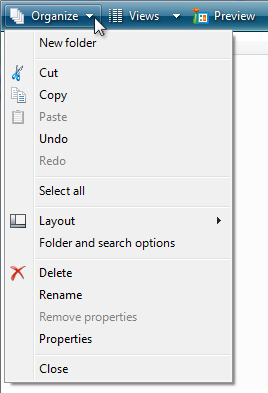
I always thought menus had icons so they could be matched to the same functionality on the toolbar. If a menu lacks an icon, then it's probably not on the toolbar. This falls apart when there is no toolbar. But I have definitely found an action in the menu, looked at the icon, and matched it to a a button elsewhere.
I believe Microsoft Office 97 for Windows was the first time I saw icons next to menu items. Office 97 had highly customizable menus and toolbars. Each menu item and toolbar item could be thought of as an action with an icon and a label, and that action could be placed in either a menu or a toolbar. Not every menu item had an icon associated with it. Additionally, each icon was colored and was clearly distinct.
This is definitely where I would this pattern - MS Office 97’s customizable toolbars necessitated this model where every single thing you could do in the application had an icon.
It then got copied into Visual Studio, where making all of the thousands of things you could do and put into custom toolbars or menus have visually meaningful icons was clearly an impossible task, but it didn’t stop Microsoft trying.
I assume Adobe, with their toolbar-centric application suite, participated in the same UI cycle.
By the time of Office 2007 Microsoft were backing off the completely customizable toolbar model with their new ‘Ribbon’ model, which was icon-heavy, but much more deliberately so.
Many KDE apps (Dolphin, Kate, Okular, etc.) let you configure their tool bars (or get rid of them entirely) and set them to show just icons, text, or both (with the text to the side or below). It's the kind of thing most people won't bother with, but for frequently used applications it's nice to be able to customize it to suit your needs. It's done via a config option though, not by dragging menu items to the toolbar (which strikes me as something you could initiate by mistake).
MS Office’s fully customisable toolbars, complete with built-in icon editor.
…ripped out when the Office Ribbon was introduced in 2007; the now-limited customisation is now considered an improvement because of the IT support problems caused by users messing up their own toolbars.
I mean, yes; but that’s what Group Policy is for! And the removal of the icon editor is just being downright mean to bored school kids.
My biggest design peeve of the examples posted is the inconsistent indentation of each section of the menu. Where if any single item in the section has an icon it gets indented, but if none do it doesn't, and seeing them next to each other is jarring. I feel this is especially inconsistent design because if a menu item has a check mark it indents all menu items in the whole menu. I would have thought Apple would have the taste to keep things more consistent across the whole menu than that, as it seems sloppy.
> Hey, unless you can articulate a really good reason to add this, maybe our default posture should be no icons in menus?
Challenge accepted. If a user (esp. one whose cognition generally prefers visual media) uses a menu item frequently, they can remember its icon and that makes it easier to find in the future.
(Doesn't apply to me personally though because I'll instead remember the underlined letter and press it next time. My pet peeve in menus is not icons, but missing or clashing hotkeys.)
Almost 30 years ago MS Office 97 was putting toolbar icons in their menus, and I think it served the useful function of helping users discover when functionality was available another way.
There was a comic artist I used to follow when I was doing more front end work, who would blog about his craft. One of the things he said that really hit me was talking about silhouettes. The visual noise in certain eras of comics make them very unapproachable. If you repainted your strip by flood filling everything with black, would people have any clue what's going on?
One of the things I'm seeing in some of these examples is icons with the same silhouette doing nothing or less than nothing for scannability. This is the same problem AWS has. Their dashboard is just noise, because the icons are neither visually distinct nor descriptive of the project.
I've also seen some of this same problem with card and board games as well. You can see that some designers care about accessibility. This type has both a distinct color AND shape so colorblind people can see it, all the icons are big enough that people can make them out sitting upside down in front of the person across the table from them, even if they're over 40.
His first example, Google Sheets, does well by this metric IMO, but the next few are kinda bad.
Responding to myself to add: If AWS is bad at this, Atlassian is worse. I cannot scan the tab bar in my browser and find what tab I was in three minutes ago because they are all too uniform. They're more concerned that I know that a tab is an Atlassian Tab than whether I can get my work done.
I actually like the icons from his example of Google Docs, it makes it easy for me to locate an action type I’m looking for (add/delete etc) without reading the labels, then once I narrowed it down - I can read the label to find the precise action I want.
Same here. I view the text labels as a more detailed description I can read if I don’t understand the icon at first glance. The icons help with decreasing time spent searching for the option I want. Not having to read every single menu item saves some number of milliseconds which adds up over time and reduces cognitive load.
Not sure I agree. It's much easier for me to find the link icon than "Insert Link" in the Google Docs example. It's seem pretty close to a standard icon so, for me at least, it's helpful to find it. Same wit some of the others like increase indent, decrease indent, left, right, center justification, and lots of others.
I can also be helpful for non-English (or non-language of your choice) when you haven't had time to localize or don't have perfect localization. Let's assume the user has Japanese as their second language. It's much easier to find the option you want with icons than without
When only some things have icons, it's almost like a flag that these things are more special/useful/used. I think that is by far more useful than everything having an icon that you have to think about (or see the text next to it) to understand
I've seen some apps that have icons on menu items when those icons are used for the same functions in other UI elements (shortcut bars, etc.) that don't require digging into the menus, functioning as kind of a reminder that "you can do this elsewhere where you see this symbol". It is kind of like an inverse tooltip (where a tooltip you get by checking the icon and discovering the action description, this you get to by going to the action in the menu and discovering the icon.)
I think this is a useful pattern, but I'm not convinced that having specific distinct icons for menu items to highlight them as important is useful. Presentation order and/or simply a consistent difference in presentation for the highlighted items makes more sense.
It's pretty common that some things are more likely to be the things you are looking for than others. Drawing eyes to such things is helpful, whereas putting abstract monochrome line-art icons everywhere is not really helping anyone find anything.
Some things are only occasionally what you are looking for, and making them require a full scan of every menu entry is fine.
This a really interesting and persuasive read for me. I've been thinking about this topic as part of brainstorming a simple design system and I had come to the conclusion that the inconsistency of not having icons for every menu item was a big annoyance. After seeing how descriptive the icons are in older menu examples compared to the abstract blobs in newer menus, I have to admit I might be wrong. At the very least, ensuring that the icons themselves are as illustrative as possible about the intended outcome of its selection is necessary.
It also makes me think about the classic Save icon: the floppy disk. That was certainly descriptive at its origination, but is it still so? In the age of natively storing documents in the cloud or copying to a USB drive, it seems like we might want more than one save menu or an appropriate icon for where the file resides on the single Save menu item. Microsoft Office has the Autosave toggle switch that serves some of this purpose, but it could definitely be better.
I also think about the Zune UI where sometimes a menu consisted only of the icons. How do you enable unique menu designs like Zune without icons for everything?
Check out how Blender’s entire UI (menus, buttons, hotkeys, pie menus, toolbar tools, context menus, etc) is built on a single abstraction: operators -- universal command objects that can be used in many contexts.
Every operator has:
Identifier: mesh.extrude_region_move
Label: human-readable string, like "Extrude Region"
Description: tooltip text, like "Extrude selected vertices, edges or faces along their normals"
Icon: optional enum from Blender’s built-in icon set, like ICON = 'MESH_EXTRUDE_REGION'
RNA properties: parameters / flags like direction, axis, booleans
Poll function: whether it is available in current context, like only enabled when a mesh is in edit mode
Execution logic: the actual command code
Blender’s designers generally follow these principles:
Operators always have labels. Icons are optional.
Most menu items use no icon by default.
Only well-established visual operations (cursor, transform tools, viewport shading modes, etc.) get icons.
Unlike macOS Tahoe’s vague "everything gets an icon" ideology, Blender uses icons when they convey meaning, but not when they’re decorative filler.
I changed the UX in my mobile app from text only to icon + text by default in menus, buttons, and links.
There are several reasons I made the switch, but the primary reason is that it makes it easier to build a kind of muscle memory for navigating and performing particular actions. In essence, the text is there for new users and the icons are there for experienced users.
It's kind of a shame how we keep trying to make icons look uniform, either in color, or in shape.
Like I open the app drawer on my Android phone and there are like 16 different icons, all different Google apps, all are round and various abstract configurations of the same exact four colors.
Feels like we're falling into the same trap that Gothic handwriting did with the minims. Yeah it looks very pretty but it's almost completely illegible since we've taken away all the things that help set icons apart.
https://en.wikipedia.org/wiki/Minim_(palaeography)#/media/Fi...
Yeah, I learned that using Netscape 6 with a row of blue balls for icons; going from the older Mozilla builds with the Netscape 4-style icons it was a definite downgrade. Pheonix had a row of orange balls; they later switched to IE-style icons with distinct shapes, which was better.
The recent Android releases where everything is a squircle really sucks too.
I feel like shortcuts are often enough. They function quite like this: a symbolic language that allows you to build up an intuition. They use icons that you already know, and instead of being bespoke per designer (how many different save icons are there?) they work across your entire OS. The muscle memory you build, instead of being bespoke per menu (and dynamic in time), allows you to skip the menu entirely!
I like icons (and colors, but those are still mostly missing) to quickly find a frequent action. If the menu is always the same you can learn the position, but with dynamic entries it's way more difficult.
I think it used to just mean "singular", from the Latin grex, gregis meaning herd, and e/ex meaning "out of". It could mean singularly bad or singularly good I guess in English, but in Latin I think it had more of a connotation of exceptional, extraordinary, eminent.
I think this is an example of the emojification of communication. I suspect that trend is being sustained, at least, by LLMs who are prone to abusing vapid emojis everywhere.
I think that to a certain superficial level of analysis, a matched set of icons looks "complete" and indeed impressive. Designers and implementers of the interface can fool themselves through customary use that they're creating a language of ideograms. Their users, who interact with their product only a few hours per week, only perceive visual noise and clutter.
Have you seen any specialized software, e.g. AutoCAD by Autodesk?
In the top ribbon menu there are icons only. And not any familiar ones at all.
Icons, text representations of the action behind the menu items…
It's a designer hell in which you have no chance to please everyone. Like someone using a vim editor for 20 years... some people are using icons, other want text and the third group wants combination of both.
Autocad (and most other professional design software) is like that because the vast majority of people that learn how to use it will do so whether they like it or not, because it’s a professional or school requirement. It sucks for beginners but if you’re using the software day in and day out for a few weeks, you’ll learn them, and then pick up the CLI commands for your most frequently used commands. After that, you’d be loath to give to give up the screen real estate for text labels.
These are technical programs for technical work performed by trained technical people. They have different workflows, goals, mindsets and ways of reasoning about things than developers do, and that’s fine.
A lot of shade gets thrown at nontechnical software users for not grasping things developers find intuitive. Yet, when many of those same people throwing that shade encounter a technical environment they can’t grasp immediately, it’s the interface's fault.
I wonder if part of the problem is the lack of color in these examples? I remember Microsoft Office 97 and 2000, which had icons in their menus (albeit only for a few actions, not for every action). However, those icons were colored and appeared visually distinct from each other.
Yesterday I booted my 350MHz Power Mac G4 for the first time in 13 years. I booted into Mac OS 9.2.2. I remember the Apple menu having icons for every item. Once again, though, every icon was in color.
And the loss of skeuoumorphism. As much as designers chide it, skeuoumorphic interfaces are, when done well, a massive improvement in usability compared to flat/monochrome ones, both for new and experienced users.
It's not really visual "clutter", the shadows / pseudo-3d elements help the brain distinguish between different types of elements, providing contextual information.
Maybe you misunderstood the author. They wrote: ‘It’s not that I think menu items should never have icons. I think they can be incredibly useful. It’s more that I don’t like the idea of “give each menu item an icon” being the default approach.’
The point is, if every item in a long menu has an icon, then they typically can’t all be very distinguishable and recognizable, and blur together visually. It creates more visual noise, and less structure, than if only some items had an icon.
As for finding groups quickly, for example it doesn’t make sense give all of “Save”, “Save as…”, “Save all” an icon, but giving the first one an icon helps to recognize the “Save” group of operations.
But isn’t the second half of the article the author pointing out a bunch of menu examples from macOS Tahoe where some items have icons and others don’t and still coming to the conclusion that it’s confusing? How is that not a contradiction of the prior declaration?
Yeah, that's a bit inconsistent. I think they are criticizing that it appears to be random which menu items have icons assigned, instead of (for example) giving all important or frequently used items an icon, or in some way that creates visual structure in the menu. Personally, what I find the most disconcerting in those examples is that the menu items aren't consistently inset.
Here is what I would think is a fairly good use of icons: https://learn.microsoft.com/en-us/windows/win32/uxguide/imag...
The icons are positioned such that they introduce groups of menu items, and they create a visual structure that one learns to recognize with repeated use.
I agree that there should not be icons in menus (with the exception of those indicating the status, like is shown in the 2005 guidelines). (Arrangements, shapes, etc might also sometimes be useful to indicate, but these should be separate from status indicators if they are present, and should be a part of the text instead in the few cases where they are applicable; in most cases they should not be needed.)
Showing a check mark for if something is active can make sense, and other status indicators, but then it should also indicate if the status is currently absent. (On Windows, some menu items can have a check mark, but if there isn't, it does not tell you if it is one that could have a check mark or not. Indicating this could be useful.)
Another thing that the menus do have, and which they should have because it is good to have, is specifying which keys are used to operate those commands. Windows also has one underlined letter so that you can select it when the menu is displayed, which can also be useful (especially since not all commands have keys assigned normally, so using the keys to activate the menus can be used in this case).
My own programs with menus do not use icons (and do not usually use icons outside of menus either).
> What I find really interesting about this change on Apple’s part is how it seemingly goes against their own previous human interface guidelines (as pointed out to me by Peter Gassner).
> They have an entire section in their 2005 guidelines titled “Using Symbols in Menus”
Just right-click any file in VSCode/Cursor to see how absolutely chaotic and tedious a long menu is without icons. Now imagine that Google Docs example without icons.
It’s much easier to recognize the funnel icon to make a filter, than to skim all that text.
MS Office only has icons for the things that matter most. I think MS even had a UI guideline similar to the one that is cited from apple in TFA, but I cannot find it.
The author doesn't ask for _no_ icons at all. So I really don't get this critique.
Intentionally omitting some icons is a really powerful tool to draw attention to the actions that the user wants to do most of the time.
I think that pattern went away in some places because it looks more consistent (that doesn't mean that usability is better) and some designers have some kind of OCD. At least that's what I have experienced in that exact case.
Over the years I've noticed something unusual about myself: I don't even see these icons. My brain goes directly to the text. This applies to all visual material, but is most evident in printed advertising.
Apparently other people notice the hot girl and the puppy and the fried chicken sandwich first. Meanwhile, I've already read all the fine print.
I think that icons hold value so long as they have mostly distinct colors (which none of his examples do, so his point stands). At least for me, colors make vastly superior landmark than words do (once i know the interface).
It has always been so since the dawn of modern desktops. I don’t see how/why this is noise. This is like a developer at a standup insisting we can make the app faster adding some micro services, flashy UX, and a few months of work while the - end user will still enter 20 order changes in an 8 hour day because that’s the environment.
From the article: "What I find really interesting about this change on Apple’s part is how it seemingly goes against their own previous human interface guidelines..."
Welcome to Apple of the last decade. As an avid user of many Apple products, this has been extremely frustrating to experience. Hopefully Alan Dye's departure will see at least partial return to obeying Apple's own HIG.
The author is criticising 2025 macOS for not following the 2005 HIG. This is not reasonable criticism, the HIG are not set in stone and they have changed many times in the past 20 years.
And if you go do the work of tracking down newer HIG versions, they say the exact same thing.
2014:
"Avoid displaying an icon for every menu item. If you include icons in your menus, include them only for menu items for which they add significant value. A menu that includes too many icons (or poorly designed ones) can appear cluttered and be hard to read."
Newer versions seem to have escaped being properly archived anywhere, so Apple can gaslight us all into believing the HIG has never changed, that we have always been at war with East Asia, that giving a bad icon to every single menu icon has always been good, and that rule was never arbitrarily changed at the whims of a cardboard box designer and his liquid glarse aesthetics.
It works out though because it does give me ammo when people use these guidelines to thoughtlessly defend poor design as if they are axiomatic rules. For 20+ years having lots of icons in a menu was bad...but now...it's good! Why? I dunno! It just is!
The examples he showed, I didn’t mind. From the title, I thought he might be referring to the emojis in READMEs. Those annoy me and don’t add anything. (I assume all vibe-coded)
I honestly really like that this has a tell-tale and hope we maintain this convention.
If the author didn't care about their project enough to write the README themselves, I don't usually spend the energy to consider the project at that point.
Another article in the category of "I am an able-bodied anglophone silicon valley man and I think X should not exist because it doesn't serve ME". Ignoring and ignorant that there are 8 billion people out there, of varying ethnic and linguistic background, with different ableness, of different education and literacy levels.
I think the key in apples guidelines is the word arbitrary. A lot/ most of the icons in apples menus are purpose made for the menu item - so it’s not as big of an issue.
The explanation for why they do it is pretty simple: localization hinting. From country to country, the text will change but the icon pictures won't. So if you find some how-tos or guidance online that has screenshots but wasn't made in your language, you can still follow along by lining up the icons.
This is just rage bait or comment bait. Anyone who designs UI for the real world already knows people barely read text, and an icon is worth a thousand words. Also results in less cognitive fatigue.
My brain first started doing this with online ads as well.
The habit has adapted and evolved very strongly with the amount of exercise it gets from UIs, textbooks, signage, and basically every other visual medium possible these days. It has actually become a problem with how often I overlook important information due to it being situated in a "nothing useful will ever be here" zone. But it's difficult to consciously control that instinct when it's correct 99.999% of the time.
Wow. Icons in Menus are so useful that I absolutely didn't expect this article is to complain about them. They help me location the item I'm trying to click tremendously.
Come on, could we get back to hating Cloudflare or something?
There are so many reasons to add icons as many have already stated here. One reason i didnt see is for multi lang help. Sometimes the icon is enough when i dont know the language used.
However, i think what may be described here is that apps often deviate from a “universal” standard or reuse something to mean another. This defeats most of the benefits of using icons imo.
I always took it as a plus for soft internationalization, e.g. we may not have translated or localized to the current user language, but icons area decent generic hint.
#/media/File:Minims_(palaeography).jpg)
Also, I disagree with:
> This posture lends itself to a practice where designers have an attitude of “I need an icon to fill up this space”
Sure, that does technically happen, but is in no way preventative or mutually exclusive with the follow on thought:
> Does ... the cognitive load of parsing and understanding it, help or hurt how someone would use this menu system?
That still happens, because if they mismatch an icon with text, that can result in far worse cognitive load/misunderstanding than if no icon was present at all. This becomes readily apparent in his follow on thought experiment where you show someone a menu with icons+text, but "censor" the text. Icons+text is also superior to [occasionally icons]+text in the same thought experiment. From my perspective, the author just argued against their own preference there.
I'd argue that the thought process behind determining an appropriate icon is even more important and relevant when being consistent and enforcing icon+text everywhere, not diminished. It also has the broadest possible appeal (to the visual/graphically focused, to the literary focused, to those who either may not speak the language, and/or to those who are viewing the menu with a condensed/restrictive viewport that doesn't have room for the full text). Now, if the argument is predicated on "We aren't willing to pay a designer for this" then yeah, they have a point. Except they used Apple as an example so, doubt that was the premise.
reply